Every designer is in an endeavor to outbid everything conventional when it comes to web design. In order to attract and engage, sometimes designers ditch best web design practices and resort to something called web design brutalism.
The relatively new design principle involves ditching traditional practices like intuitive UI in favor of something that’s completely disruptive.
Deciphering the Brutalist Web Design Principle
Brutalist Web Design came into the picture when Pascal Deville introduced this design trend in the web design arena. As the founder of an online portfolio of brutalist websites, he documents web designs that portray a lack of concern for looking easy or comfortable.
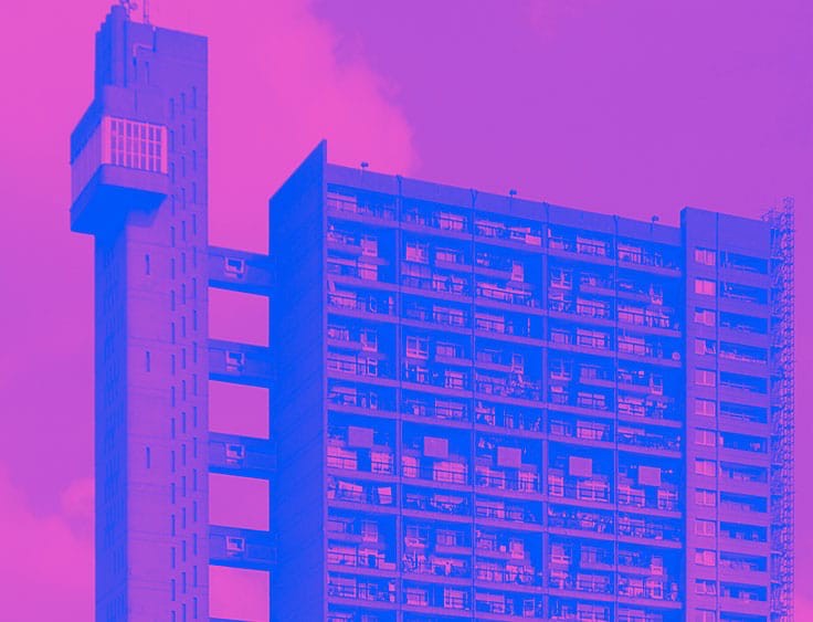
In fact, brutalism in web design can be seen inspired by an architecture movement in the 1970s in which architects left concrete construction of buildings exposed to depict ruggedness and crude. The same principle in web design is what brutalism is all about- an approach that’s being outlined as a hallmark reaction of next-gen web designers towards minimalism and optimistic designs.
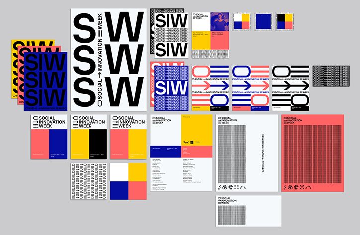
Brutalism in web design might be a new practice but it was a common style during the 50s and 60s to design print graphics, art and posters.
Brutalism & Modern Digital Landscape
In an age of dwindling attention span, brutalism can mean business for brands looking to attract customer attention. As brutalist websites are turned-down to bare necessities, the design is known to promote easy navigation, quick loading and fewer distractions for visitors.
Essentially, brutalist web design strips off unnecessary elements from a web page like video, high-res graphics and slow-loading CMS to promise a swift website that offers only what’s needed by the visitor. Brutalist design trims excessive design fat to enhance website performance and reduce page load time.
Demarcating the Boundaries between Brutalist Web Design & Anti-design
Asymmetry has convinced people to confuse brutalism principles with anti-design. However, there are remarkable differences and brutalism cannot be just written off as anti-design.
Brutalism is all about leaving a very personalized and non-standard identity to a web page- a move away from template-based and standardized web designs that dominate the internet, today. It’s not just about chaos, rather it’s about originality that is inspired by a bygone architectural design principle.
Comparing this to anti-design, it is observed that anti-design is only about stripping down the UI to create disorienting or ugly interfaces. Though these also use harsh colors and disorienting patterns, anti-design is meant to distract which is quite the opposite of brutalism.
Brutalism is a concrete principle with a legacy. It’s not the absence of design but a different approach to design which enhances the performance of web pages by removing everything that’s unnecessary. Though it might appear ugly to anyone who sees it for the first time, brutalist web design is something that has been at the core of some of the biggest websites like Craigslist in the world.
The Soaring Popularity of Brutalist Web Designs
Brutalist web designers make use of 90s era graphics and hand-coded HTML to create website frameworks. As brutalist design portrays honesty, practicality and realism, it is becoming increasingly popular among users, despite the bad graphics. Out-of-place text and tacky graphics tend to grab attention more efficiently than minimalist and streamlined designs. The whole idea of brutalism is to break the conventions and stand out.
Moreover, as discussed above, brutalist design speeds up the website. In the modern context, this is extremely beneficial as websites with higher page load timings suffer from high abandonment rates. So, in turn, the possibility of higher conversions is leading to an increased popularity of brutalism in web design.
All over the world, more and more brands and companies are coming ahead to try brutalist designs. Craigslist is a glorious example of a popular website that has adopted brutalism in its core offering.
Best Brutalist Web Design Practices
While you may not be convinced about the efficacy of brutalist web design, there are thousands of enthusiasts and brutalist proponents in the web design ecosystem. If you are also intrigued about the benefits of brutalist design and want to use it for your next project, here are some best practices for following the brutalist design principle:
- Use prominent and distinctive background in black or white without shading or textures
- Ditch design sophistications like shadows, gradients or patterns
- Use a single font throughout the entire website or monospaced typography
- Follow a crowded design pattern with non-padded elements and closely-placed texts
- Don’t use a distinct hierarchy for content placement
- Overlap elements in a way that seems unintentional
- Use analog-style design elements of bygone era
- Follow asymmetrical patterns and frameworks, everywhere
- Dissimilar common color palette that gives prominence to green and red
- Avoid animations and go in favor of nonconformist visuals
- Follow one-page design with simple or no navigation
- Use distinct imagery in monotonic shades or black and white
- Commit yourself to design a website that seems to have a lot of visual inconsistencies and mistakes like overprinting and non-alignment

Getting Started with Brutalist Web Design: What & How to Do?
Now that you know the best practices, you can think of implementing this design concept in your next project. Due to practicality aspects, you would not want to go for a crude brutalist design altogether for a project as your client/company might not like the same. Instead you can think of experimenting with various brutalist elements and integrating them into professional or business websites. Brutalism is all about personalization and adding a sense of personality to a web page by clipping off every unnecessary element. So, think of a web page as your canvas and start creating a masterpiece by heart.
You can go for brutalist web design in two ways. Either you can choose a brutalist WordPress theme for a website as your foundation or you can hand-code your website from scratch using a page builder tool. Both approaches have their own pros and cons.
Using Brutalist WordPress Themes
WordPress themes save time, effort and investment on part of a designer or a company as it offers readymade elements to kickstart the web design process. Though it might be a good idea, but there are not many options when it comes to brutalist themes. Some themes which you can try are FlowMag, Brutal and Glitch.
But it’s better that you carve your own brutalist web design. This way you will be able to customize each element. Take a minimalist theme as your base and start hand-carving your design by coding under the hood.
Hand-coding a website from scratch
Hand-coding a website might be time-consuming, but if you want to go with brutalist web design, this might be your best bet. Alternatively, if you don’t want to put in a large amount of efforts, you can use a powerful page builder tool like Elementor for perfecting a brutalist web design. There are more than one reasons for this choice.
Firstly, it presents a blank-slate default theme that gives you the power to customize and perfect your design from the beginning. Secondly, it offers many customization options which give you a freehand to experiment with different on page elements.
Useful Brutalism Tips for Web Designers
Know Your Audience
Though there are no hard and fast rules when it comes to brutalism, you need to understand and know your audience in depth. Brutalism isn’t for every business or brand. You should only adopt brutalism approach if you trust that the design strategy aligns to your business goals. If such design is turning away your audience, you should ditch your love for brutalist designs.
Unbalance. Unbalance. Unbalance!
Probably, the first thing you might have learned is to balance the white spaces to create a soothing and intuitive web design for end users. But if you are looking to try your hands-on brutalism, you will have to unbalance the white spaces on a web page by using dissimilar and big color blocks. You will have to forget all the conventions when it comes to aesthetic pleasantness.
Ditch Beauty over Practicality
Brutalism is all about being pragmatic. If you are looking to create the perfect brutalist web design, you need to avoid the design clichés and focus on just a single thing- conversion. Avoid using pretty-looking elements on your web page and instead, keep everything simple and to-the-point.

Use Dissimilar Shapes
Brutalist web designs are inspired by 20th-century architectural trends that made use of eccentric and abstract shapes of all sizes. During the mid-20th century, dissimilar shapes in single color tones were popular when it came to buildings. The same applies to modern-day brutalist web design. When following the brutalist approach, use mismatched shapes.
Intriguing Real-life Brutalist Web Design Examples
Brutalist designs don’t fit in the standard web design principles. However, some companies, websites and popular platforms have been using this concept with great success. Apart from the examples mentioned above, here are some more real-life examples. Though these might not seem attractive, all these have implemented brutalist principles with absolute perfection.
1. Hacker News
Hacker News is a popular platform that has successfully stripped down the bulky elements on its website to make it crude, crisp and clear. You can see how brutalist design works for them by looking at the interactions and engagement level.
2. Plant22
Plant22 has successfully adopted an alternative approach to brutalism by using colorful modular bricks. The grid-based brutalist design is in trend and does wonders for responsiveness. Such kind of brutalism which speeds up the website without being harsh on eyes is something worth adopting.
3. PICTURE(S) NOW
In the Pictures Now website, one can see several elements of brutalism such as a solid background color, non-hierarchical fond and oversized text in the middle of the web page. All these represent core brutalism principles.
Brutalist Web Design: Concluding Remarks
Though brutalist web designs promise a higher number of conversions owing to its sharp impact, it isn’t suitable for every business or brand. The key element in deciding for or against brutalist web design is to conduct an in-depth analysis of pros and cons, see if brutalism aligns to your brand image, industry you work in and the aspirations of your target audience.
Though a lot of custom web application design & development companies are propagating the brutalist approach, it is important to make a wise decision by evaluating all the aspect related to your modern web design requirements. And when in a flux, make sure to get in touch with some expert who can help you with making an informed decision. Don’t just rush into the hype. Stay wise and choose something that adds value to your business’ online footprint. So, what are you waiting for? Start thinking about brutalist design, today and see if it can really be useful for your website.


