


Icons form an integral part of any website design. From use in informational and navigational elements, to eye-catching parts of a larger design, icons and icon-based elements can be an attractive and interesting way to draw in users.
While icons have used a dramatically flat aesthetic for a while, more projects are shifting to isometric icon usage. This trend is appearing on websites and print projects across plenty of different industries.
It’s gaining popularity because isometric icons have a more realistic look while still using flat layers. It’s an almost perfect mix of flat and depth. Here’s a more in-depth look at this design trend and how you can make the most of it.
What is the Isometric Icon Trend?
Quite simply, isometric design is a method of drawing/creating a three-dimensional object in two dimensions. Isometric icons are an extension of this design technique and the place where this trend seems to be picking up the most traction.
It works because isometric icons have shape, simplicity, and depth. They evoke the beauty of flat design but with an added depth and dimension that makes each element more visually appealing and easier for the user to understand.
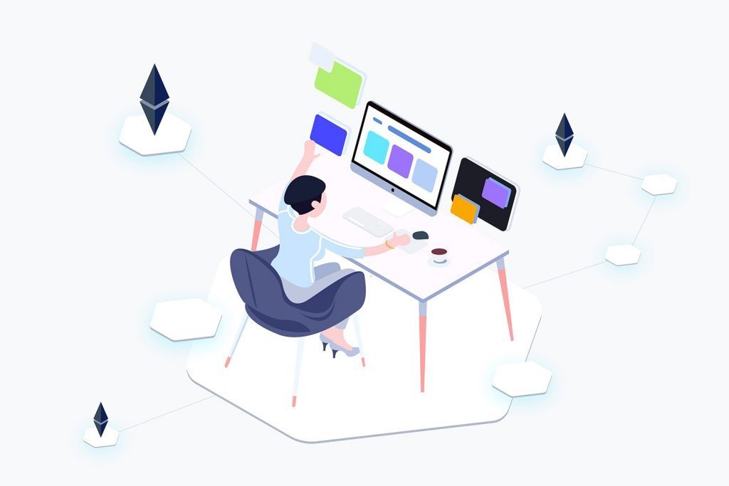
Most designers are also opting to create and use isometric icon sets with shapes and elements that look real in combination with bright color schemes. This can be an attention-grabbing combination for users, with color to draw people into the design.
Using shadows and a different perspective when creating each icon can help add flow and visual hierarchy to a design. This isometric version of an environment should be a mini replica of an actual object.
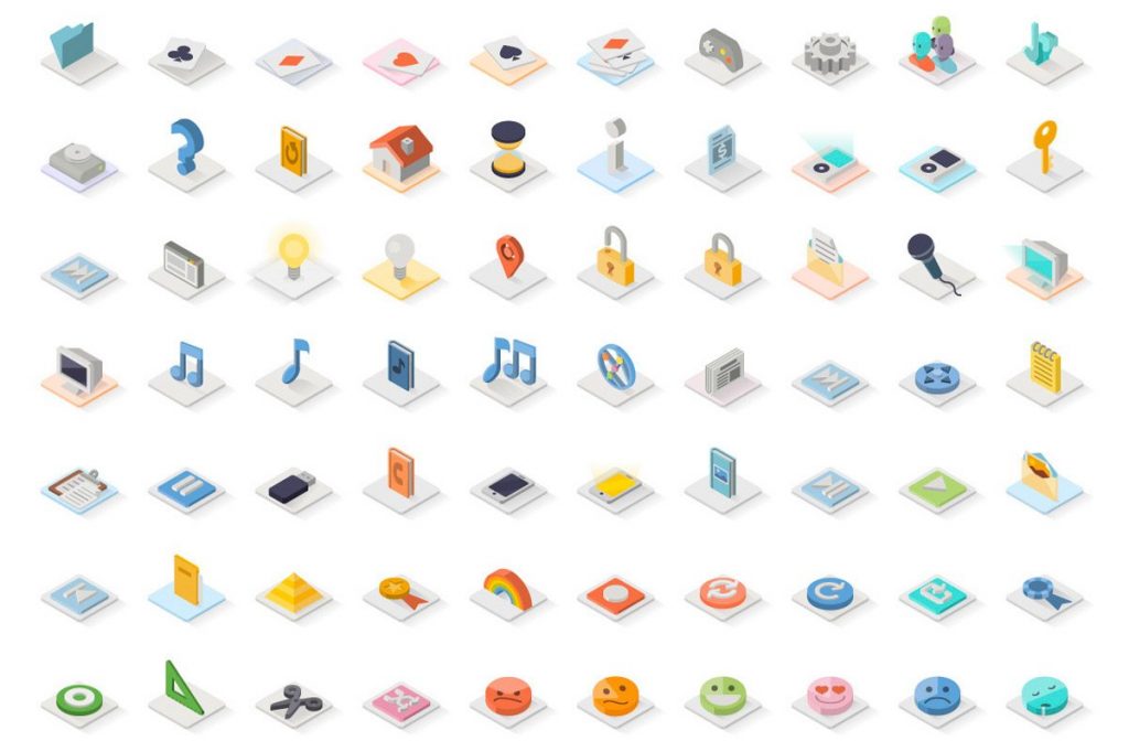
Icon elements for infographics are another popular application of this design trend. With Smaller isometric icons inside larger infographics, this style is an easy way to add visual interest and usability to a project. Thanks to a more realistic style, isometric icons can help add understanding of a concept or ides for users.
A Natural Evolution From Flat Icons
Isometric icons are an evolution of the flat design trend, flat 2.0 and material design. The 3D to 2D design still uses clean and simple lines and styling but with a little more depth.
Color palettes are frequently derived from flat and material as well.
Isometric styles are the perfect mashup of simplicity and information, with an icon design that’s easy for users to understand and has the flat styling that many designers love to work with.
Things to Be Aware Of
Some argue that the style comes off as too “cartoony” for some applications. Others worry that bright color schemes can detract from messaging or look garish to users. You have to use this design trend with care.
Building an isometric icon set can be more time consuming than designing flat icons. There’s a level of detail and the almost three-dimensional effect that have to be considered. And if the view or orientation is wrong, the result can be jarring or disorienting. (For a quick start project, you might find that it’s best to download a kit and hope it includes everything you need.)
With so much style variation in isometric icons, some elements might appear almost “overdrawn” or “overdesigned.” These elements should be avoided. If you find yourself looking at and thinking about how the element was put together, it is probably a little bit too much. The best design – when it comes to users – is fairly invisible; the element should be apparent and work well, but not to the degree you think about the actual look of it.
Using too many isometric icons without a plan can get overwhelming. Remember, these icons have more depth and detail than a traditional flat element. Unless you have a plan for using them in groups, you should probably take care not to overload users with too many elaborate icon illustrations.