


Let us assume that you just got yourself the latest version of a smartphone with a full range of innovative applications, sleek design, and amazing performances. You cannot wait to try it out, but there seems to be a problem. Some of the web pages seem unadjusted to your phone screen or even appear as broken. How come?
The problem is not in your device, but in those websites’ design. And the question is whether fluid, adaptive or responsive design had been applied during their web design process.
What are the differences between these three approaches?
We are going to explain them here in more details, so stay on board.
DEFINING DIFFERENT DESIGN TYPES
You have probably heard about responsive design, although you may not be an expert in web design terminology. On the other hand, if you are web designer yourself, you know that it is pretty much of a standard nowadays.
But, what exactly does being responsive mean for the website, and what do a fluid and adaptive design stand for?
To understand these types, we must define the fixed design first.
FIXED PAGE LAYOUT
Pages with fixed or static width layout are designed for a specific predetermined width and they do not change, no matter the display aspect ratio or the screen size that the viewer has. Width is specified in a pixel value, with the most common width being 960 pixels, and it does not respond to diffenet screen sizes.
This kind of web design is not so much in use anymore, but there are still fixed web pages out there. You can recognize them when the horizontal scroll bar appears while looking at the website on your mobile phone, or when only half of the page is visible, pictures are cropped, and written content is untraceable. That might definitely damage the page overview and users’ experience, and that is why the fixed layout is not so popular anymore.
FLUID DESIGN
Opposite to the fixed layout, fluid or liquid design has the width specified as a percentage. It is based on relative units and proportional widths, making pages scalable and adjustable to various screen sizes.
Standard screen size used to be 1024×768 pixels, but so many people have higher resolution screens nowadays. That is why fluid design is very helpful.
Whenever the screen size changes, elements of a fluid layout spread over the same percentage of space. Blocks of content, images and other elements are going to stretch or shrink according to the screen size.
To make the web design fluid, you should know how to incorporate it within a code.
ADAPTIVE DESIGN
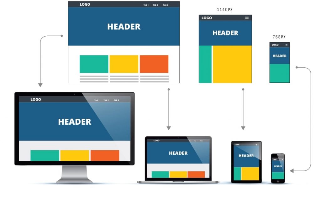
Adaptive design is the process of creating a website or a theme with specific devices and screen sizes in mind. It means creating exclusively for iMac, for instance, or for 13.3-inch laptops, iPhone, Galaxy watch, or any other device with specific display sizes.
If a design is made adaptive, it means that there are actually several versions of design that are created, each one of them made for a specific size. However, the layout is not precisely defined by adaptive design, rather within a specific range of screen sizes.
Compared to a fluid design, adaptive means more certainty in a functional user interface and a positive user experience. Another plus is the speed of loading adaptive pages, as there are not much of adjustments and pages should load quickly.
RESPONSIVE WEBSITE
Designing a separate design for various screen sizes might be better than a fixed page layout, that is for sure. But, it is also time-consuming and energy-draining. And this is where responsive web design enters the scene.
As a combination of flexible grids, fluid layouts and intelligent use of media queries, with media-specific CSS defined for different resolutions, responsive design has been one of the designers’ favorites lately.
A responsive website uses queries to control the content as it scales up or down on in accordance with the device that the viewer is using. It also responds to the user’s behavior and the device’s orientation.
Responsive design is based on so-called set containers and breakpoints, which divide possible screen sizes in ranges and adjust page elements accordingly. So, the layout might look completely different on a large desktop monitor and on a small mobile phone display. This type of design is also good for avoiding an empty space on the screen.
WHICH ONE TO CHOOSE?
Long gone are days when there was only one typical size of PC displays. Now, designers are faced with the challenge of designing for desktops, laptops, tablets, reading devices, watches and, of course, mobile phones of all shapes and sizes.
So, yes, it can become quite confusing if you get to choose the type of design to apply to each and every project you are working on as a designer. Should it be adaptive or responsive?
We recommend thinking about the website goals first and then deciding the design type. For example, if you are going to build a website that does not have a mobile version of web pages, but a native Android or iOS application instead, maybe adaptive design might be a good solution.
On the other hand, always have in mind that responsive design is almost an imperative in today’s world, and a lot of clients are actually going to expect responsive design for their website. So, you would not want to disappoint them, would you?
Besides that, some of these types are usually combined. For example, one might say that every responsive design is also fluid, but not ever fluid design is responsive.
CONCLUSION
As you can see, it is all about the screen sizes and page layouts.
So, if your newest phone has a non-standard display aspect ratio or an unusual resolution, you may find it difficult to adjust some of the web pages, videos, and apps to fit your screen. Having in mind that phones with aspect ratio 18:9 have flooded the market lately, in contrast to the standardized 16:9, but the majorities of videos or even websites have not been adjusted yet, it becomes clear that some changes in design should be made. And the best solution is to adjust them automatically through a responsive design.